Edits
Visual identity · art critique publication · 2026VISUAL IDENTITY FOR EDITS, AN ART CRITIQUE PUBLICATION
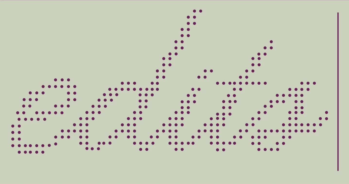
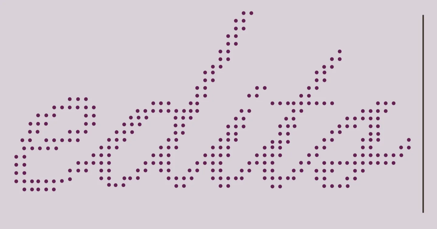
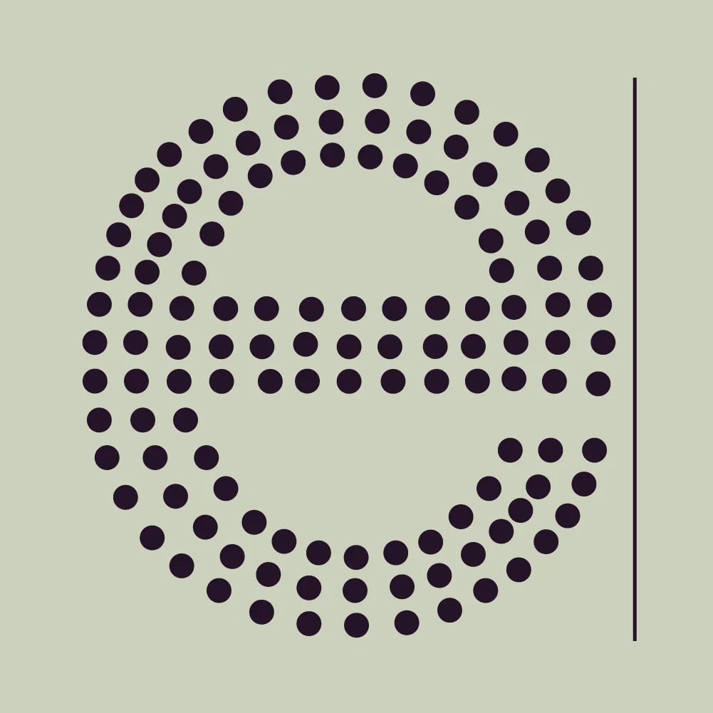
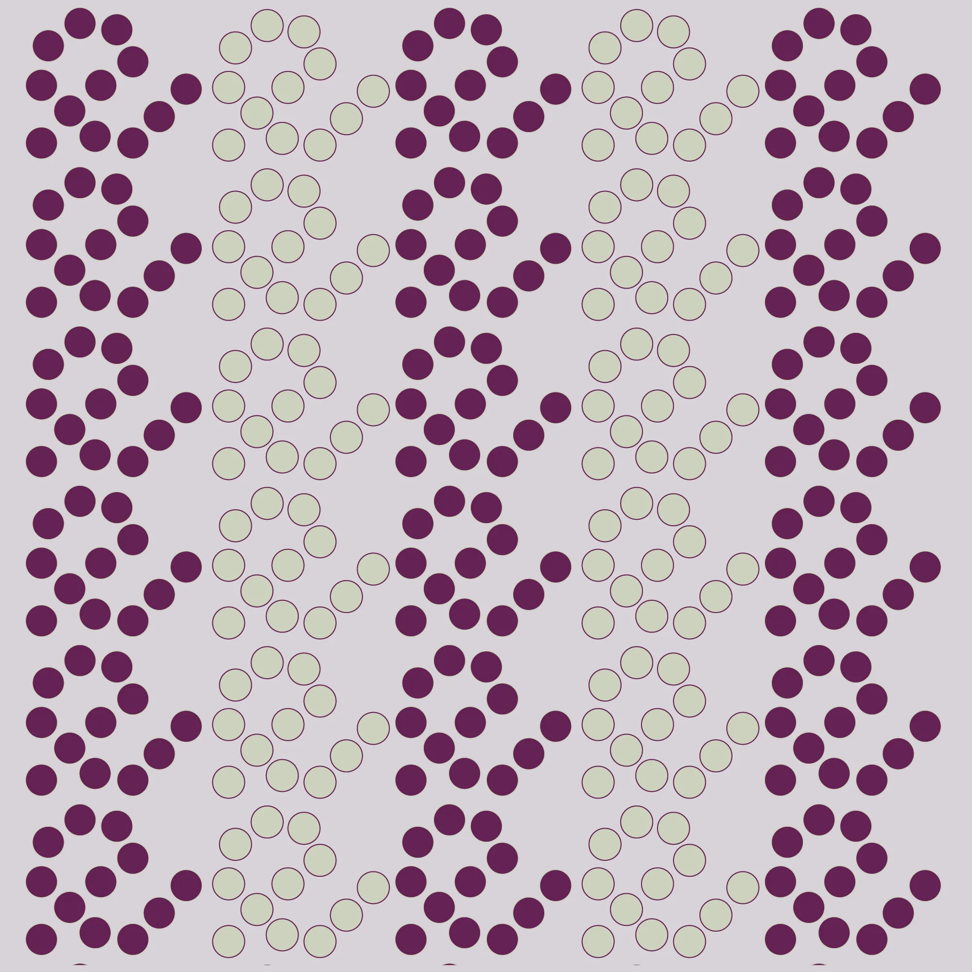
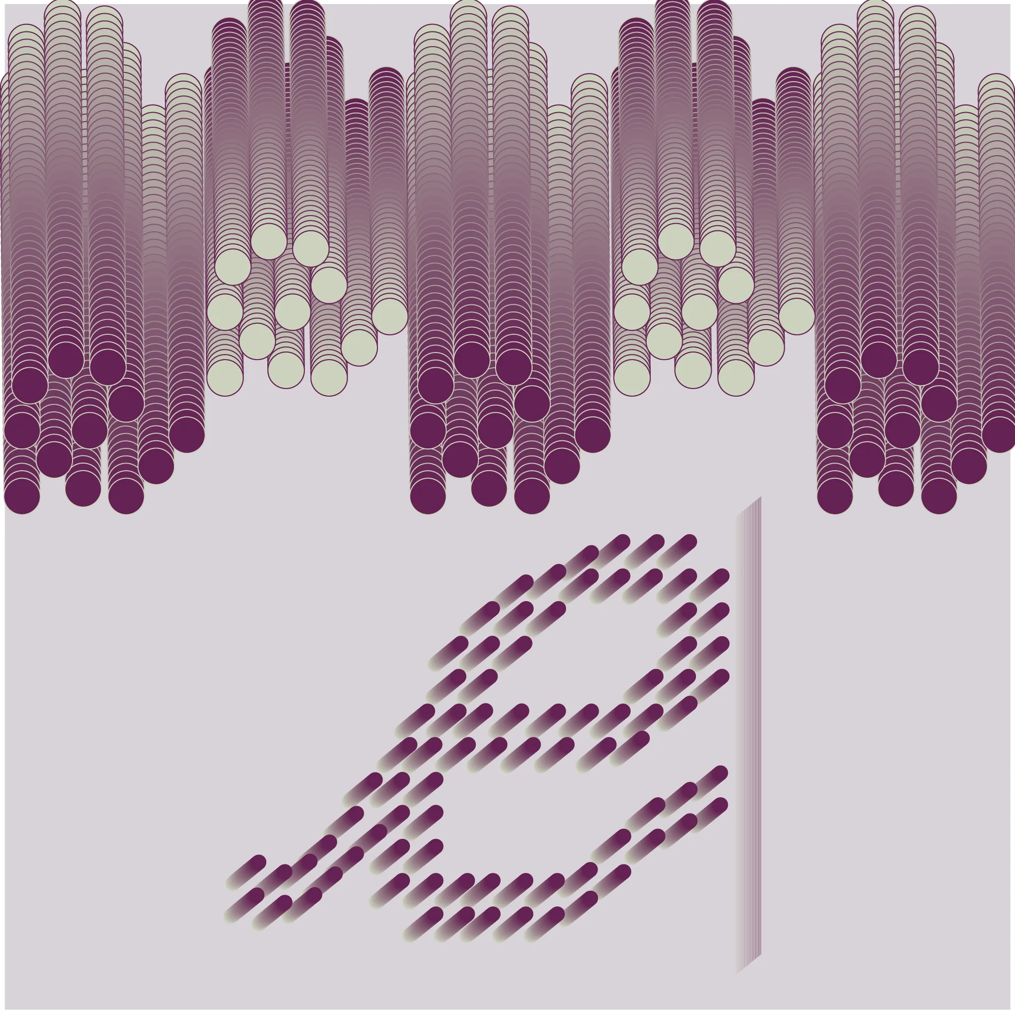
Edits is an online art critique publication. The identity comes down to two things: the word edits and a blinking cursor, the pause between the last word and the next. The marks are built from small dots, which is also where the layout of the publication's Drafts page comes from: a live field of points standing in for thoughts still forming.
Marks
Type
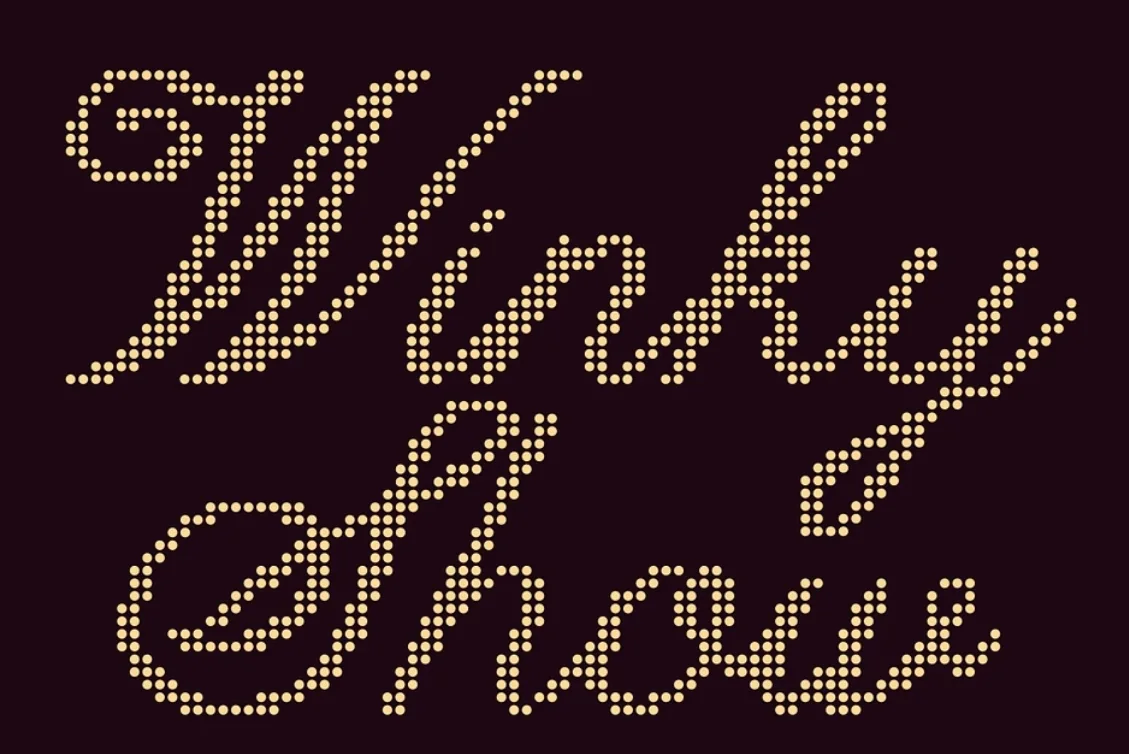
- DisplayWinky Show
- HeadingsFraunces
- BodyHanken Grotesk
- MetaHandjet
Romantic against computational: a dotted script for the big moments, a serif for editorial weight, a calm grotesque for long reading and a pixel face for the system voice.
Pattern
Colour
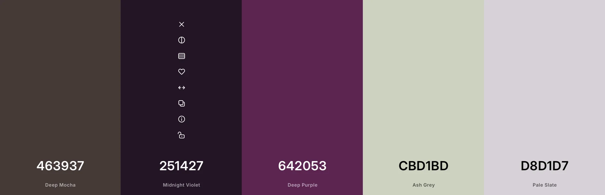
06 Palette
#463937 Deep Mocha#251427 Midnight Violet#642053 Deep Purple#CBD1BD Ash Grey#D8D1D7 Pale Slate